© Christina Auyeung 2024
© Christina Auyeung 2024
© Christina Auyeung 2024
© Christina Auyeung 2024
Personal Brand
Personal Brand
Personal Brand
Engaging in this project was such a fun journey where I delved deep into defining my personal brand while simultaneously pushing the boundaries of my graphic design expertise.
Engaging in this project was such a fun journey where I delved deep into defining my personal brand while simultaneously pushing the boundaries of my graphic design expertise.
Engaging in this project was such a fun journey where I delved deep into defining my personal brand while simultaneously pushing the boundaries of my graphic design expertise.
Engaging in this project was such a fun journey where I delved deep into defining my personal brand while simultaneously pushing the boundaries of my graphic design expertise.

Background
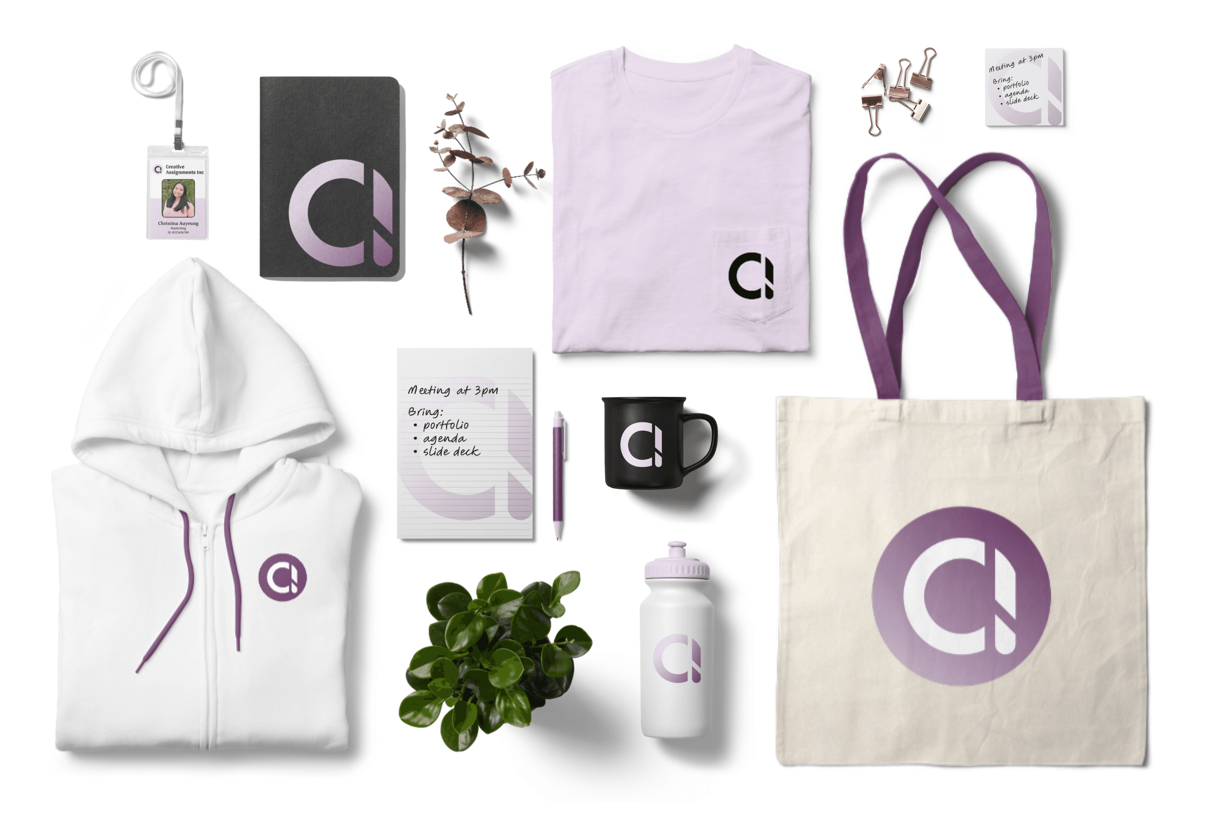
When it came to branding, I wanted to explore both the importance of color and also a logo that would represent me. The logo needed to feel intrinsic to my personality and identity, but also be polished enough that it would be easily recognizable. I opted for clean geometric lines to imbue a modern, polished feel, while utilizing colors to infuse personality and vitality into the design.
Logo
In crafting the logo, my focus was on seamlessly intertwining my initials into a singular, cohesive emblem rather than two distinct letters. After some experimentation I ended up with the idea of integrating the letter "c" into the curved portion of the letter "a". This exploration resulted in the creation of the logo showcased below.
Inspired by the strategic use of negative space, the design prompts the viewer to view the letter "a" as composed of two distinct components: the curve from the letter "c," and the vertical bar, morphing it into an "a." The negative space creates separation between the curve and the vertical bar creating the "separate letters" within the logo. Leveraging negative space further, I incorporated a subtle tail for the "a" within the vertical bar. To maintain the harmony of the merged letters, I ensured that the top of the vertical bar followed the same curve from the "c."
After many, many iterations and valuable insight from my friends and family I've produced a logo that I'm proud to say represents me.



Logo Color
While it was important to have the logo be able to stand alone in monochrome settings, I wanted to inject some life and personality with my choice of colors. When creating my portfolio I created a custom color palette as the theme and later used the same colors for my logo. I kept the colors to shades from the purple monochrome family as I didn't want to overshadow the strong logo. By enclosing the logo within a circle, I provided a background color option, enhancing its visual impact and ensuring consistency across different applications. In addition to the standalone black version, I created various color iterations for different use cases. This thoughtful approach to color selection not only injects life into the logo but also maintains its coherence and effectiveness across different contexts.
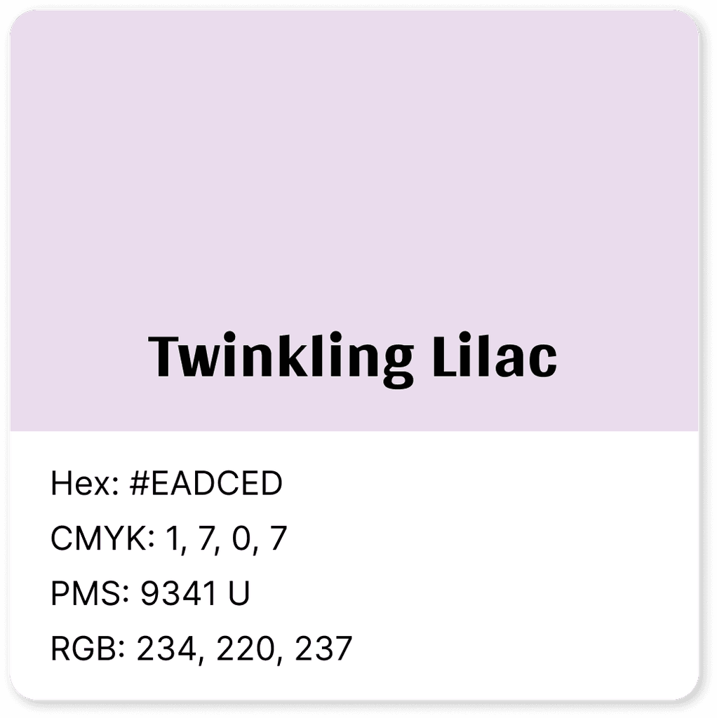

Light and airy, Twinkling Lilac feels whimsical, and makes me think of the last fading colors of a sunset. Purple in color theory terms often represents creativity.
Light and airy, Twinkling Lilac feels whimsical, and makes me think of the last fading colors of a sunset. Purple in color theory terms often represents creativity.
Light and airy, Twinkling Lilac feels whimsical, and makes me think of the last fading colors of a sunset. Purple in color theory terms often represents creativity.
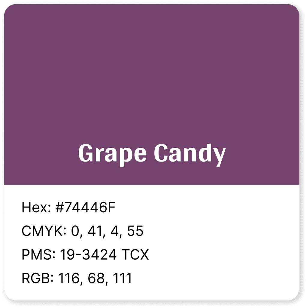

Bold and royal, Grape Candy gives a sense of depth and a little bit of mysteriousness.
Bold and royal, Grape Candy gives a sense of depth and a little bit of mysteriousness.
Bold and royal, Grape Candy gives a sense of depth and a little bit of mysteriousness.






Light and airy, Pale Purple feels whimsical, and makes me think of the last fading colors of a sunset. Purple in color theory terms often represents creativity.


Majestic and royal, Finn gives a sense of depth and a little bit of mysteriousness.
Portfolio Theme
In crafting my portfolio, I predominantly used my primary colors, Twinkling Lilac and Grape Candy, to establish a cohesive visual identity. Recognizing the need for additional colors to add base and levity, I introduced complementary shades to fulfill supporting roles, preventing monotony and ensuring a balanced theme. My goal was to have to colors come together to elicit the feeling of a spa on a brisk autumn day: warm, inviting, grounded, and relaxing.
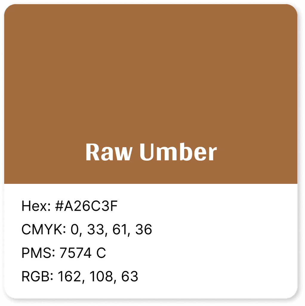

Warm, Cozy, Reliable
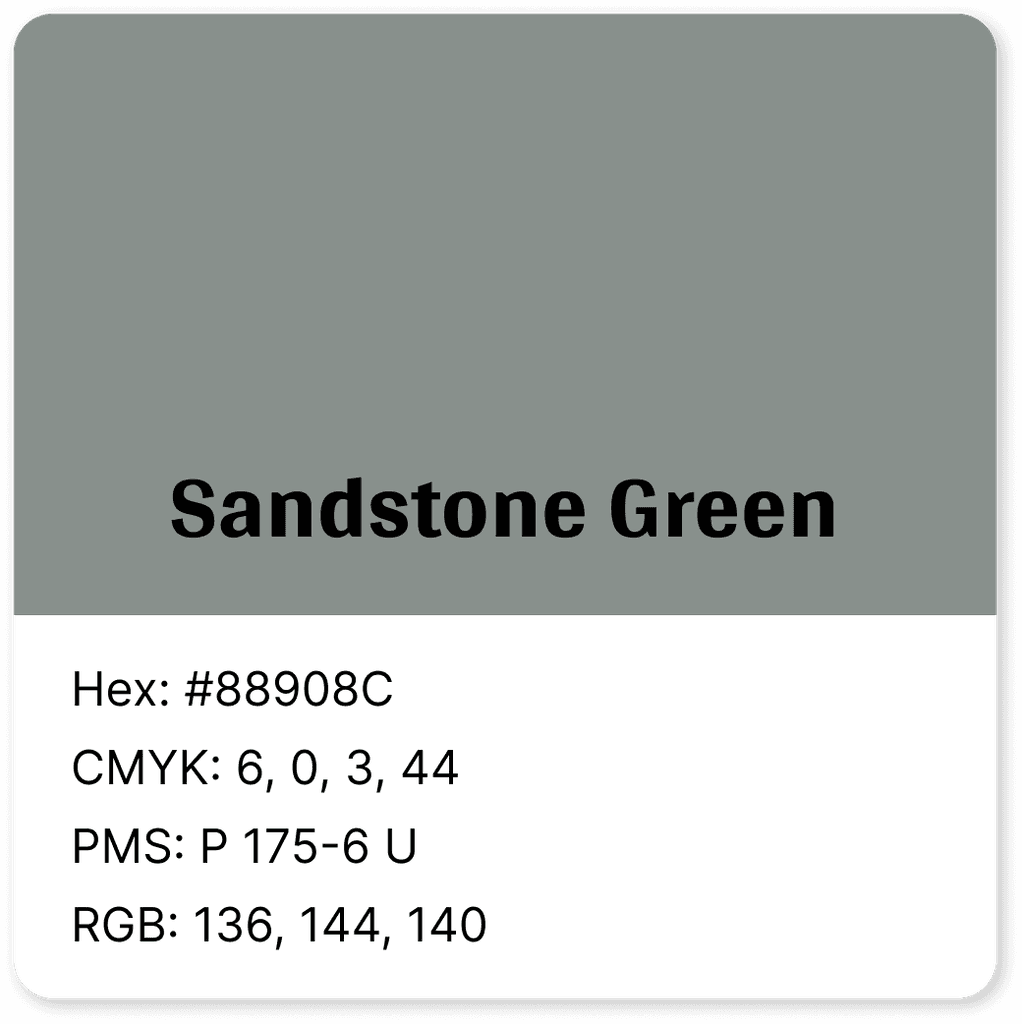

Grounded, Practical, Depth
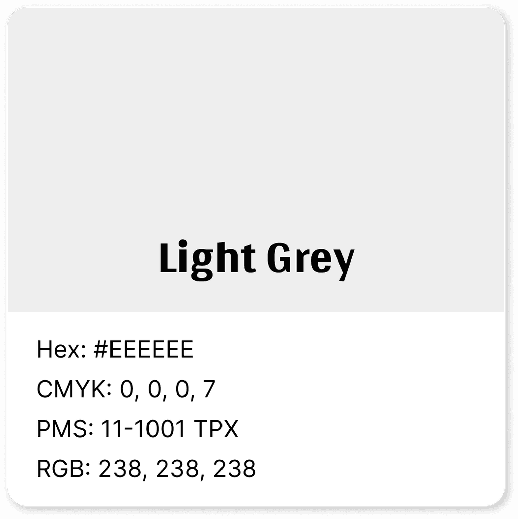

Soothing, Base, Familiar


Warm, Cozy, Reliable
Warm, Cozy, Reliable
Warm, Cozy, Reliable


Grounded, Practical, Depth
Grounded, Practical, Depth
Grounded, Practical, Depth


Soothing, Base, Familiar
Soothing, Base, Familiar
Soothing, Base, Familiar
Reflections
This was my favorite part of my portfolio to work on, but also had the most hours put into it. My mentor guided me through what it takes to create a logo and the many iterations and ideas that go into the creation of one. My Figma file is just a spread of different shapes and letters trying to flesh out a coherent logo.
I'm extremely proud of my logo and color palette that I crafted. It resonates with my professional identity, seamlessly blending sophistication with a hint of whimsy. It's a reflection of myself, exuding professionalism and personality in equal measure.